

The IT Professional’s Guide to Effective Color Scheme Design
1: Understanding Color Theory
The Basics of Color Theory
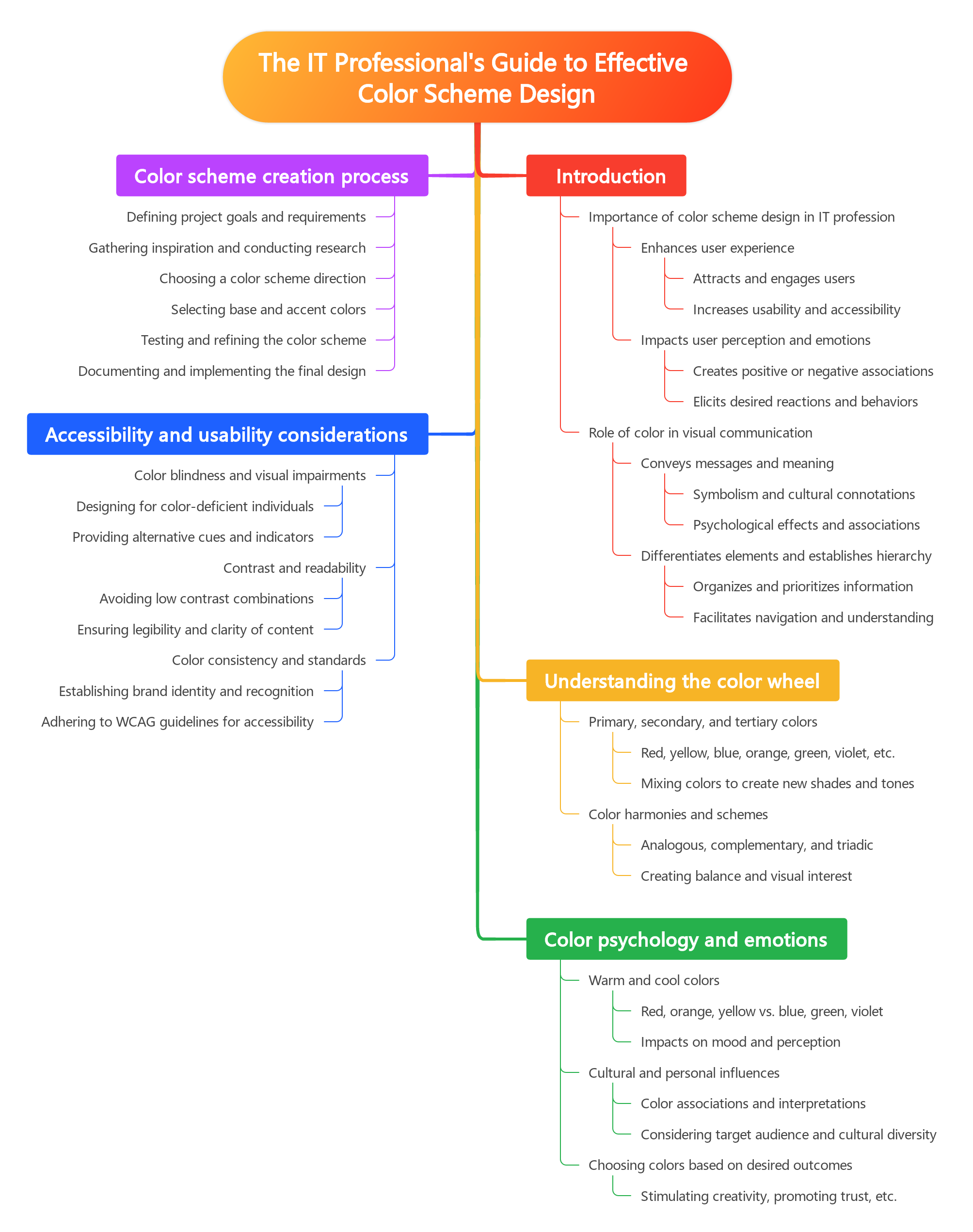
Color theory is an essential concept for IT professionals to understand when designing effective color schemes for digital products. By mastering the principles of color theory, IT professionals can create harmonious and visually appealing color schemes that enhance user experience and engagement. In this subchapter, we will explore the basics of color theory and how it can be applied to color scheme design.
One of the key principles of color theory is the color wheel, which is a visual representation of the relationships between colors. The color wheel is divided into primary colors (red, blue, and yellow), secondary colors (green, orange, and purple), and tertiary colors (colors created by mixing primary and secondary colors). By understanding the relationships between these colors, IT professionals can create color schemes that are balanced and aesthetically pleasing.
Another important concept in color theory is color harmony, which refers to the combination of colors that are visually appealing when used together. There are several types of color harmony, including complementary colors (colors that are opposite each other on the color wheel), analogous colors (colors that are adjacent to each other on the color wheel), and triadic colors (colors that are evenly spaced on the color wheel). By using color harmony in their designs, IT professionals can create color schemes that are visually cohesive and pleasing to the eye.
On the other hand, color theory also encompasses the idea of jarring color combinations, which are colors that clash and create visual discord. While jarring color combinations can be used to create bold and attention-grabbing designs, they can also be overwhelming and off-putting to users. IT professionals should be mindful of the impact of jarring colors in their designs and use them sparingly to avoid creating a negative user experience.
In conclusion, understanding the basics of color theory is essential for IT professionals who are involved in color scheme design. By mastering the principles of the color wheel, color harmony, and jarring color combinations, IT professionals can create visually appealing and effective color schemes that enhance user experience and engagement. By applying these principles in their designs, IT professionals can create digital products that are both aesthetically pleasing and user-friendly.
The Psychology of Color
The psychology of color is a fascinating field that explores how different colors can affect our emotions, perceptions, and behaviors. As IT professionals, understanding the psychology of color is crucial when designing websites, applications, and other digital products.
Color scheme design plays a significant role in how users interact with your product. A harmonious color scheme can create a sense of balance and unity, making it easier for users to navigate and engage with your design. On the other hand, a jarring color scheme can be off-putting and distracting, leading to a negative user experience.
When choosing colors for your design, it’s essential to consider the emotions and associations that different colors evoke. For example, blue is often associated with trust and reliability, making it a popular choice for financial institutions and technology companies. In contrast, red is often associated with passion and urgency, making it a good choice for call-to-action buttons or alerts.
In addition to individual colors, the combination of colors also plays a crucial role in creating a harmonious color scheme. Complementary colors, which are opposite each other on the color wheel, can create a vibrant and dynamic look. Analogous colors, which are next to each other on the color wheel, can create a more subtle and cohesive design.
By understanding the psychology of color and how it impacts user behavior, IT professionals can create more effective and engaging designs. Whether you’re designing a website, an app, or a digital product, choosing the right color scheme can make a significant difference in how users perceive and interact with your design. Ultimately, a well-thought-out color scheme can enhance the user experience and help you achieve your design goals.
Color Harmonies
Color harmonies are essential in creating visually appealing and effective color schemes for any design project. As IT professionals, understanding the principles of color harmonies can greatly enhance the user experience of your digital products and websites. By utilizing harmonious color combinations, you can create a sense of balance and unity that will attract and engage your audience.
There are several types of color harmonies that you can use to create cohesive and visually pleasing designs. One of the most common types is the complementary color scheme, which involves using colors that are opposite each other on the color wheel. This creates a high-contrast look that can be both bold and eye-catching. Another popular harmony is the analogous color scheme, which uses colors that are next to each other on the color wheel. This creates a more subtle and harmonious look that is easy on the eyes.
When choosing a color harmony for your design project, it’s important to consider the emotions and associations that different colors evoke. For example, warm colors like red, orange, and yellow are often associated with energy and excitement, while cool colors like blue, green, and purple are more calming and soothing. By understanding the psychological effects of different colors, you can choose a color harmony that will best convey the message and tone of your design.
In contrast to harmonious color schemes, jarring color combinations can create a sense of discord and confusion in your designs. These combinations often involve colors that clash or create visual tension, making it difficult for users to focus on the content of your website or application. While jarring color schemes can be used for specific purposes, such as creating a sense of urgency or drawing attention to a particular element, they should be used sparingly and with caution.
Overall, mastering the art of color harmonies is essential for IT professionals looking to create effective and aesthetically pleasing designs. By understanding the principles of color theory and experimenting with different color combinations, you can create designs that are not only visually appealing but also convey the right message and tone to your audience. Whether you choose a complementary, analogous, or monochromatic color scheme, the key is to create a sense of balance and unity that will enhance the user experience and make your designs stand out.
2: Importance of Color Schemes in Design
Impact of Color Schemes on User Experience
Color schemes play a crucial role in shaping the user experience of digital products and websites. As IT professionals, it is important to understand the impact of color schemes on user experience and how they can affect the overall success of a project. Harmonious color schemes are designed to create a sense of balance and unity, making it easier for users to navigate and interact with a product. On the other hand, jarring color schemes can create a sense of dissonance and confusion, leading to a negative user experience.
When designing a color scheme, it is important to consider the psychological impact of different colors on users. For example, warm colors like red and orange can evoke feelings of energy and excitement, while cool colors like blue and green can create a sense of calm and relaxation. By understanding the emotional responses to different colors, IT professionals can create color schemes that effectively communicate the desired message and evoke the intended emotions in users.
In addition to the psychological impact of colors, it is also important to consider the practical implications of color schemes on user experience. For example, using high contrast colors for text and background can improve readability for users with visual impairments. Similarly, using a consistent color scheme across all pages of a website can help users navigate and understand the structure of the site more easily. By considering these practical implications, IT professionals can create color schemes that enhance usability and accessibility for all users.
One of the key challenges in color scheme design is finding the right balance between creativity and functionality. While it is important to create visually appealing color schemes that reflect the brand identity of a product, it is equally important to ensure that the colors are used in a way that enhances the usability and accessibility of the product. By striking the right balance between creativity and functionality, IT professionals can create color schemes that not only look great but also improve the overall user experience.
In conclusion, the impact of color schemes on user experience cannot be underestimated. Harmonious color schemes can create a sense of balance and unity, while jarring color schemes can lead to confusion and frustration. By understanding the psychological and practical implications of color schemes, IT professionals can create designs that effectively communicate the intended message and enhance the usability of digital products and websites. By finding the right balance between creativity and functionality, IT professionals can create color schemes that not only look great but also improve the overall user experience.
Branding and Color Schemes
Branding and color schemes play a crucial role in the overall design of a website or application. As IT professionals, it is essential to understand how color can impact the user experience and convey the brand message effectively. A well-thought-out color scheme can help create a harmonious and visually appealing design that resonates with the target audience.
When it comes to branding, color plays a significant role in establishing brand identity and recognition. Consistency in color usage across all touchpoints, such as the website, logo, marketing materials, and products, helps reinforce brand recognition. IT professionals need to work closely with designers and marketing teams to ensure that the color scheme aligns with the brand’s values, message, and target audience.
In the world of color scheme design, there is a fine line between harmonious and jarring color combinations. Harmonious color schemes are visually pleasing and easy on the eyes, creating a sense of balance and unity in the design. On the other hand, jarring color schemes can be overwhelming and distracting, causing users to feel confused or disoriented. IT professionals must be aware of color theory principles and best practices to create visually appealing designs that enhance the user experience.
Choosing the right color scheme for a project involves considering factors such as the target audience, brand message, and desired emotional response. Understanding the psychology of color can help IT professionals make informed decisions when selecting colors for a design. For example, warm colors like red and orange can evoke feelings of excitement and energy, while cool colors like blue and green can create a sense of calm and trust.
In conclusion, branding and color schemes are essential elements of effective design that can make or break the user experience. IT professionals must collaborate with designers and marketers to create cohesive and visually appealing color schemes that align with the brand’s message and target audience. By understanding the principles of color theory and psychology, IT professionals can create harmonious designs that enhance the overall user experience and drive brand recognition.
Accessibility Considerations
Accessibility considerations are crucial when designing color schemes for any digital platform. As IT professionals, it is important to ensure that the color choices we make are inclusive and considerate of all users, including those with visual impairments or color vision deficiencies. By taking accessibility into account, we can create designs that are not only visually appealing but also easy to navigate and understand for all users.
One key consideration when designing color schemes is ensuring sufficient color contrast. This is particularly important for users with low vision or color blindness, as they may have difficulty distinguishing between certain colors. To address this, IT professionals should use tools such as color contrast checkers to ensure that text and background colors have enough contrast to be easily readable. By following accessibility guidelines for color contrast, we can create designs that are accessible to a wider range of users.
Another important consideration for accessibility in color scheme design is the use of color combinations that are easy to distinguish for all users. This includes avoiding color combinations that may cause discomfort or confusion for those with color vision deficiencies. By choosing colors that are distinct and easily recognizable, we can ensure that our designs are inclusive and user-friendly for all individuals, regardless of their color vision abilities.
In addition to considering color contrast and color combinations, IT professionals should also think about the overall usability of their color schemes. This includes ensuring that colors are used in a consistent and meaningful way throughout the design, and that they are not relied upon as the sole means of conveying information. By using color as a supplement to other design elements, such as text or icons, we can create designs that are accessible and functional for all users.
Overall, accessibility considerations are essential when designing color schemes for digital platforms. By prioritizing inclusivity and usability in our color choices, we can create designs that are not only visually appealing but also accessible to all users. As IT professionals, it is our responsibility to ensure that our designs are considerate of the diverse needs of our users, including those with visual impairments or color vision deficiencies. By following best practices for accessibility in color scheme design, we can create designs that are harmonious and user-friendly for all individuals.
3: Creating Harmonious Color Schemes
Analogous Color Schemes
Analogous color schemes are an essential tool in the arsenal of any IT professional looking to create visually appealing designs. These schemes are based on colors that are next to each other on the color wheel, creating a harmonious and cohesive look. By utilizing analogous colors, IT professionals can create designs that are pleasing to the eye and evoke a sense of unity and balance.
One of the key benefits of using analogous color schemes is that they are easy to work with and can help streamline the design process. By choosing colors that are already in close proximity on the color wheel, IT professionals can quickly create a color palette that works well together. This can save time and effort in the design process, allowing IT professionals to focus on other important aspects of their projects.
Another advantage of analogous color schemes is their ability to create a sense of harmony and cohesion in a design. By using colors that are closely related, IT professionals can create a unified and balanced look that is visually appealing. This can help to create a sense of order and organization in a design, making it easier for users to navigate and understand.
While analogous color schemes are known for their harmonious and cohesive look, it is important for IT professionals to be aware of the potential pitfalls of using these schemes. One common issue is creating a design that is too monotonous or lacking in contrast. To avoid this, IT professionals can introduce a pop of color or use different shades and tints of the analogous colors to create visual interest.
In conclusion, analogous color schemes are a valuable tool for IT professionals looking to create visually appealing designs. By using colors that are next to each other on the color wheel, IT professionals can create a harmonious and cohesive look that is easy to work with. While there are potential pitfalls to using analogous color schemes, with careful consideration and attention to detail, IT professionals can create stunning designs that are both harmonious and visually engaging.
Complementary Color Schemes
In the world of design, color schemes play a crucial role in creating visually appealing and harmonious compositions. One of the most popular and effective color schemes is the complementary color scheme. Complementary colors are pairs of colors that are opposite each other on the color wheel, such as red and green, blue and orange, or yellow and purple. When used together, these colors create a high contrast and vibrant look that can make your designs stand out.
Complementary color schemes are particularly popular in IT design because they create a dynamic and eye-catching visual impact. By using colors that are opposite each other on the color wheel, you can create a sense of balance and harmony in your designs. This can help draw the viewer’s eye to key elements of your design, such as calls to action or important information. IT professionals can use complementary color schemes to create visually striking websites, apps, and marketing materials that are both aesthetically pleasing and effective in conveying information.
When using complementary color schemes, it’s important to consider the contrast between the colors you choose. While high contrast can create a bold and attention-grabbing look, it can also be jarring if not used carefully. IT professionals should be mindful of how they use complementary colors in their designs to ensure they create a harmonious and visually appealing composition. By balancing the use of complementary colors with neutral tones or other color harmonies, you can create a cohesive and balanced design that captures the viewer’s attention without overwhelming them.
One way to ensure your complementary color scheme is effective is to use a color wheel or color palette tool to help you choose the right colors. These tools can help you identify complementary colors that work well together and provide guidance on how to use them in your designs. IT professionals can also experiment with different shades, tints, and tones of complementary colors to create depth and dimension in their designs. By taking the time to carefully select and balance complementary colors, you can create visually stunning and engaging designs that are sure to make a lasting impression on your audience.
In conclusion, complementary color schemes are a powerful tool in the IT professional’s arsenal when it comes to creating effective and visually appealing designs. By using colors that are opposite each other on the color wheel, you can create a dynamic and eye-catching look that captures the viewer’s attention. However, it’s important to use complementary colors carefully and balance them with other colors to create a harmonious composition. With the right tools and techniques, IT professionals can leverage complementary color schemes to create stunning designs that are both aesthetically pleasing and effective in conveying information.
Triadic Color Schemes
Triadic color schemes are a popular choice for many designers, as they can create a harmonious and balanced look when used effectively. In a triadic color scheme, three colors that are equally spaced apart on the color wheel are used together. This creates a vibrant and dynamic color palette that can be visually appealing and eye-catching. It is important for IT professionals to understand how to effectively use triadic color schemes in their designs to create a cohesive and visually appealing look.
One of the key benefits of using a triadic color scheme is that it can create a sense of balance and harmony in a design. By using three colors that are evenly spaced apart on the color wheel, IT professionals can create a visually pleasing composition that is pleasing to the eye. This can help to create a sense of unity and coherence in a design, making it more aesthetically pleasing to the viewer.
When using a triadic color scheme, it is important to consider the contrast between the colors that are being used. While triadic color schemes can create a harmonious look, it is important to ensure that there is enough contrast between the colors to create visual interest. IT professionals should experiment with different combinations of colors within the triadic color scheme to find the right balance of contrast and harmony for their design.
Another benefit of using a triadic color scheme is that it can create a sense of energy and vibrancy in a design. By using three colors that are evenly spaced apart on the color wheel, IT professionals can create a dynamic and visually striking color palette that can draw the viewer’s eye. This can help to create a sense of excitement and interest in a design, making it more engaging and memorable for the viewer.
In conclusion, triadic color schemes can be a powerful tool for IT professionals when designing color schemes. By using three colors that are evenly spaced apart on the color wheel, IT professionals can create a harmonious and balanced look that is visually appealing and eye-catching. By considering the contrast between the colors and experimenting with different combinations, IT professionals can create dynamic and vibrant designs that are sure to make a lasting impression on their audience.
4: Avoiding Jarring Color Schemes
Clashing Colors
In the world of color scheme design, there is a delicate balance between creating harmonious color combinations that please the eye and jarring color clashes that can cause discomfort and confusion. This subchapter, titled “Clashing Colors,” delves into the importance of understanding the impact of color choices on the overall design aesthetic and user experience. As IT professionals, it is crucial to have a solid grasp of color theory and how different colors interact with each other to create effective and visually appealing designs.
When it comes to creating harmonious color schemes, it is important to consider the principles of color theory. Colors can be categorized into warm and cool tones, as well as complementary and analogous colors. By understanding how these colors work together, IT professionals can create color schemes that are visually pleasing and cohesive. Harmonious color schemes are often used in web design, graphic design, and user interfaces to create a sense of balance and unity.
On the other end of the spectrum are jarring color clashes that can disrupt the overall design aesthetic and user experience. When colors clash, they create visual discord and can be distracting or overwhelming for users. IT professionals should be wary of using colors that are too bright, too saturated, or too contrasting, as these can create a negative emotional response and make it difficult for users to engage with the design.
To avoid clashing colors, IT professionals can use tools such as color wheels and color palette generators to create balanced and harmonious color schemes. These tools can help identify complementary colors, analogous colors, and triadic color combinations that work well together. By experimenting with different color combinations and testing them in various contexts, IT professionals can ensure that their designs are visually appealing and user-friendly.
In conclusion, understanding the principles of color theory and how colors interact with each other is essential for creating effective color schemes in IT design. By striking a balance between harmonious color combinations and avoiding jarring color clashes, IT professionals can create visually appealing designs that enhance the user experience. With the right tools and knowledge, IT professionals can confidently navigate the world of color scheme design and create designs that are both aesthetically pleasing and functional.
Overuse of Bright Colors
In the world of color scheme design, there is a fine line between creating a visually appealing website or application and creating one that is overwhelming to the senses. One common pitfall that many IT professionals fall into is the overuse of bright colors. While bright colors can certainly add a pop of excitement to a design, using them excessively can lead to a jarring and chaotic user experience.
When bright colors are overused in a design, they can create a sense of visual clutter that distracts users from the content or functionality of a website or application. This can lead to frustration and confusion, ultimately driving users away from the product. In order to create a harmonious color scheme that is both visually appealing and functional, IT professionals must exercise restraint when it comes to using bright colors.
One of the key principles of effective color scheme design is balance. By balancing bright colors with more neutral or muted tones, IT professionals can create a design that is visually interesting without overwhelming the user. For example, pairing a bright accent color with a neutral background can create a sense of contrast and hierarchy within a design, drawing the user’s eye to important elements while still maintaining a sense of harmony.
Another important consideration when it comes to the overuse of bright colors is accessibility. Bright colors can be difficult for some users to read or interpret, particularly those with visual impairments or color blindness. By limiting the use of bright colors and ensuring that there is enough contrast between text and background colors, IT professionals can create a design that is accessible to all users, regardless of their visual abilities.
In conclusion, while bright colors can certainly add visual interest to a design, they must be used judiciously in order to create a harmonious and effective color scheme. By balancing bright colors with more neutral tones, considering accessibility needs, and maintaining a sense of hierarchy within a design, IT professionals can create a visually appealing product that is both functional and user-friendly. By avoiding the overuse of bright colors, IT professionals can ensure that their designs are both visually appealing and easy to use for all users.
Contrast Issues
Contrast is a key element in color scheme design that can make or break the effectiveness of a visual composition. In the world of IT professionals, understanding how to use contrast effectively is essential for creating visually appealing and user-friendly interfaces. However, issues can arise when contrast is not used thoughtfully or when it is taken to extremes. In this subchapter, we will explore the importance of contrast in color scheme design and discuss the potential pitfalls of using too much or too little contrast.
Harmonious color schemes are those that use subtle variations in hue, saturation, and brightness to create a cohesive and visually pleasing design. These schemes often rely on low to moderate levels of contrast to maintain a sense of balance and unity. IT professionals who are tasked with designing interfaces for software applications or websites can benefit from using harmonious color schemes to create a comfortable and inviting user experience. By carefully selecting colors that complement each other and avoiding stark contrasts, designers can help users navigate their interfaces more easily and intuitively.
On the other hand, jarring color schemes are characterized by high levels of contrast that can be overwhelming or distracting to the viewer. While some level of contrast is necessary for creating visual interest and hierarchy in a design, excessive contrast can make it difficult for users to focus on important information or navigate a interface effectively. IT professionals should be cautious when using jarring color schemes, as they can lead to user frustration and decreased usability. By striking a balance between contrast and harmony, designers can create interfaces that are both visually striking and user-friendly.
One common issue that IT professionals may encounter when working with color schemes is the phenomenon of color vibration. This occurs when two colors with high contrast are placed next to each other, causing the colors to appear to vibrate or create a visual distortion. To avoid color vibration, designers can adjust the hue, saturation, or brightness of one or both colors to create a more harmonious pairing. By being mindful of color relationships and how they interact with each other, IT professionals can create designs that are visually appealing and easy to navigate.
In conclusion, understanding the role of contrast in color scheme design is essential for IT professionals who are tasked with creating visually engaging and user-friendly interfaces. By striking a balance between harmonious and jarring color schemes, designers can create interfaces that are both aesthetically pleasing and functional. By being mindful of potential contrast issues such as color vibration, designers can create designs that are visually cohesive and easy to navigate. Ultimately, mastering the use of contrast in color scheme design is key to creating interfaces that are both visually appealing and effective in conveying information to users.
5: Tools and Resources for Color Scheme Design
Color Palette Generators
Color palette generators are a valuable tool for IT professionals looking to create visually appealing and harmonious color schemes for their projects. These online tools allow users to input a base color and generate a range of complementary colors that work well together. By using a color palette generator, IT professionals can save time and effort in selecting colors that work well together, ensuring a cohesive and aesthetically pleasing design.
One popular color palette generator is Adobe Color CC, which allows users to create custom color schemes based on color theory principles such as complementary, analogous, and triadic colors. This tool is especially useful for IT professionals working on web design projects, as it provides easy access to HEX codes for each color in the palette, making it simple to implement the chosen colors in CSS code.
Another useful color palette generator is Coolors, which allows users to generate color schemes by simply pressing the space bar to cycle through random color combinations. This tool is perfect for IT professionals looking for inspiration or who are unsure of which colors to use in their design. By experimenting with different color combinations, IT professionals can find the perfect palette that fits their project’s needs.
When it comes to color scheme design, IT professionals must consider whether they want a harmonious or jarring color palette. Harmonious color schemes use colors that are adjacent to each other on the color wheel, creating a sense of unity and balance in the design. Jarring color schemes, on the other hand, use colors that are opposite each other on the color wheel, creating a bold and contrasting look. By using a color palette generator, IT professionals can easily experiment with different color combinations to achieve the desired effect in their design.
Overall, color palette generators are a valuable resource for IT professionals looking to create effective and visually appealing color schemes for their projects. By utilizing these tools, IT professionals can save time and effort in selecting colors that work well together, ensuring a cohesive and attractive design that meets their project’s needs. Whether aiming for a harmonious or jarring color scheme, color palette generators provide the flexibility and creativity needed to achieve the desired result.
Color Theory Books and Websites
Color theory plays a crucial role in the world of design, including creating effective color schemes for websites and digital products. As IT professionals, understanding the principles of color theory can greatly enhance the user experience and overall aesthetic appeal of your projects. In this subchapter, we will explore some of the best color theory books and websites that can help you master the art of color scheme design.
One highly recommended book for IT professionals looking to delve into color theory is “The Elements of Color” by Johannes Itten. This classic book covers the fundamentals of color theory, including the color wheel, color relationships, and the psychological effects of different colors. Itten’s insights can help you create harmonious color schemes that resonate with your audience and convey the right message.
Another valuable resource for IT professionals is the website Adobe Color. Formerly known as Adobe Kuler, this online tool allows you to explore color schemes, create custom palettes, and even extract colors from images. Whether you’re designing a website, app, or digital interface, Adobe Color can help you find the perfect color combinations that enhance usability and visual appeal.
For those looking to understand the science behind color theory, “Interaction of Color” by Josef Albers is a must-read. This book explores the ways in which colors interact with each other, how they can create optical illusions, and how they can be used to evoke certain emotions. By studying Albers’ theories, IT professionals can gain a deeper understanding of how to use color effectively in their designs.
In addition to books, there are several websites that offer valuable resources for IT professionals interested in color theory. One such website is Color Hunt, which provides a curated collection of color palettes for inspiration. By browsing through Color Hunt’s selection, IT professionals can discover new color combinations and trends that can inform their own design choices.
Overall, mastering color theory is essential for IT professionals who want to create visually appealing and user-friendly digital products. By exploring the resources mentioned in this subchapter, you can gain a deeper understanding of color theory and learn how to apply it effectively in your design work. Whether you’re creating a website, app, or interface, having a solid foundation in color theory can make all the difference in creating harmonious and engaging color schemes.
Design Software for Color Scheme Creation
Design software plays a crucial role in the creation of effective color schemes for various projects. For IT professionals looking to create visually appealing designs, having the right tools at their disposal is essential. Design software for color scheme creation allows users to experiment with different color combinations, test out various hues and shades, and ultimately find the perfect balance between harmonious and jarring color schemes.
One of the key features of design software for color scheme creation is the ability to generate harmonious color schemes. These tools utilize color theory principles to help users create pleasing combinations that work well together. By selecting a base color and using the software to generate complementary, analogous, or triadic color schemes, IT professionals can quickly and easily find the perfect palette for their projects. This can save time and effort in the design process, ensuring that the final product is visually appealing and cohesive.
On the other hand, design software for color scheme creation also allows users to experiment with jarring color schemes. While harmonious color schemes are often preferred for their calming and aesthetically pleasing qualities, jarring color schemes can be used to create bold and eye-catching designs. By adjusting the saturation, brightness, and contrast of colors, IT professionals can create striking and memorable visuals that stand out from the crowd.
Additionally, design software for color scheme creation often includes features for fine-tuning and customizing color schemes. IT professionals can adjust individual colors within a scheme, tweak the overall balance of hues, and even create gradient effects for added depth and dimension. This level of control allows for endless creative possibilities, ensuring that each project is unique and tailored to the specific needs and preferences of the designer.
In conclusion, design software for color scheme creation is an essential tool for IT professionals looking to create effective and visually appealing designs. Whether aiming for harmonious or jarring color schemes, these tools provide the flexibility and control needed to bring creative visions to life. By utilizing the features and capabilities of design software, IT professionals can elevate their projects and make a lasting impact through thoughtful and intentional color choices.
6: Applying Color Schemes in IT Projects
Website Design
Website design is a crucial aspect of creating a successful online presence. As IT professionals, we understand the importance of not only functionality but also aesthetics when it comes to designing a website. One of the key elements of website design is the color scheme. The color scheme of a website can greatly impact the user experience and how visitors perceive your brand. In this subchapter, we will delve into the world of color scheme design and explore the differences between harmonious and jarring color schemes.
Harmonious color schemes are those that are pleasing to the eye and create a sense of balance and unity on a website. These color schemes often consist of colors that are adjacent on the color wheel or that complement each other well. When designing a website with a harmonious color scheme, it is important to consider the emotions and feelings that different colors evoke. For example, warm colors like red and orange are often associated with energy and excitement, while cool colors like blue and green are calming and soothing.
On the other hand, jarring color schemes are those that clash and create a sense of discord on a website. These color schemes often consist of colors that are opposite each other on the color wheel or that do not complement each other well. While jarring color schemes can sometimes be used to create a bold and eye-catching design, they can also be overwhelming and off-putting to visitors. As IT professionals, it is important to strike a balance between creativity and usability when designing a website with a jarring color scheme.
When designing a website, it is essential to consider the target audience and the message you want to convey. Different color schemes can evoke different emotions and associations, so it is important to choose a color scheme that aligns with your brand and the goals of your website. Whether you opt for a harmonious or jarring color scheme, the key is to ensure that the colors you choose enhance the overall user experience and reinforce your brand identity.
In conclusion, website design plays a crucial role in creating a successful online presence. As IT professionals, we must pay close attention to the color scheme of a website and choose colors that align with our brand and the message we want to convey. Whether you opt for a harmonious or jarring color scheme, the key is to strike a balance between creativity and usability to create a visually appealing and user-friendly website. By understanding the differences between harmonious and jarring color schemes, we can create websites that engage visitors and leave a lasting impression.
App Development
In today’s digital age, app development has become an essential skill for IT professionals looking to stay ahead in the industry. With the increasing demand for mobile applications, it is crucial for developers to understand the importance of creating user-friendly and visually appealing apps. One key aspect of app development that is often overlooked is color scheme design.
When it comes to color scheme design, there are two main approaches: harmonious and jarring. A harmonious color scheme consists of colors that complement each other and create a sense of balance and unity. This type of color scheme is often used in apps that aim to create a soothing and calming user experience. On the other hand, a jarring color scheme consists of colors that clash and create a sense of tension and discord. This type of color scheme can be used to create a bold and eye-catching design, but it runs the risk of overwhelming the user.
Choosing the right color scheme for your app is crucial for creating a positive user experience. A harmonious color scheme can help create a sense of unity and cohesion throughout the app, making it easier for users to navigate and understand the interface. On the other hand, a jarring color scheme can create a sense of chaos and confusion, making it difficult for users to focus on the content of the app.
To create an effective color scheme for your app, it is important to consider the target audience and the overall purpose of the app. For example, a meditation app aimed at promoting relaxation and mindfulness would benefit from a harmonious color scheme with soft, calming colors. On the other hand, a gaming app aimed at young adults may benefit from a jarring color scheme with bright, bold colors.
In conclusion, app development is a crucial skill for IT professionals looking to stay competitive in the industry. When designing the color scheme for your app, it is important to consider whether a harmonious or jarring approach is more appropriate for your target audience and the overall purpose of the app. By taking the time to carefully consider your color scheme design, you can create an app that is visually appealing and user-friendly, ultimately leading to a more positive user experience.
Data Visualization
Data visualization is a key aspect of any IT professional’s work, as it involves presenting complex data in a visually appealing and easy-to-understand format. When it comes to data visualization, the choice of color scheme plays a crucial role in determining how effectively the information is communicated to the audience. In this subchapter, we will explore the importance of color scheme design in data visualization and discuss the differences between harmonious and jarring color schemes.
Harmonious color schemes are those that use colors that are naturally pleasing to the eye and work well together. These schemes typically involve colors that are adjacent to each other on the color wheel, such as analogous or monochromatic color schemes. Harmonious color schemes are often used in data visualization to create a sense of balance and cohesion, making it easier for the audience to interpret the information being presented.
On the other hand, jarring color schemes are those that use colors that clash or create a sense of discord when placed together. These schemes can be effective in grabbing the audience’s attention, but they can also make it difficult for the audience to focus on the data being presented. IT professionals should use jarring color schemes sparingly and strategically, as they can be overwhelming and detract from the overall message of the visualization.
When choosing a color scheme for data visualization, IT professionals should consider the nature of the data being presented and the intended audience. For example, a financial report may benefit from a more conservative and professional color scheme, while a marketing presentation may call for a more vibrant and eye-catching scheme. By tailoring the color scheme to the specific needs of the data and audience, IT professionals can ensure that their visualizations are both effective and engaging.
In conclusion, the choice of color scheme in data visualization can have a significant impact on how effectively information is communicated to the audience. By understanding the differences between harmonious and jarring color schemes, IT professionals can make informed decisions when designing visualizations that are both visually appealing and easy to understand. With the right color scheme, IT professionals can enhance the clarity and impact of their data visualizations, ultimately leading to more successful communication and decision-making.
7: Case Studies in Effective Color Scheme Design
E-commerce Website Redesign
In the fast-paced world of e-commerce, staying ahead of the curve is essential to success. One way to ensure your online store is meeting the demands of modern consumers is through regular website redesigns. This subchapter will delve into the importance of redesigning your e-commerce website and how color scheme design plays a crucial role in creating a harmonious user experience.
When it comes to redesigning your e-commerce website, it’s important to consider the overall user experience. A well-designed website not only looks visually appealing but also functions smoothly and intuitively. One key aspect of website design that can greatly impact the user experience is the color scheme. By choosing a harmonious color scheme, you can create a cohesive and visually pleasing website that encourages users to stay longer and explore more.
In contrast, a jarring color scheme can have the opposite effect, causing users to feel overwhelmed or confused. This can lead to high bounce rates and lower conversion rates, ultimately impacting your bottom line. As IT professionals, it’s crucial to understand the psychology of color and how different color combinations can affect user behavior. By choosing colors that evoke the right emotions and create a sense of trust and credibility, you can help drive conversions and increase sales on your e-commerce website.
When redesigning your e-commerce website, take the time to analyze your current color scheme and identify areas for improvement. Consider the demographics of your target audience and choose colors that resonate with them. Test different color combinations to see which ones work best in terms of readability, accessibility, and overall user experience. By continuously refining and optimizing your color scheme, you can ensure your e-commerce website remains visually appealing and user-friendly.
In conclusion, e-commerce website redesigns are essential for staying competitive in today’s digital landscape. As IT professionals, it’s important to pay close attention to the color scheme design of your website to create a harmonious user experience. By choosing colors that evoke the right emotions and resonate with your target audience, you can drive conversions and increase sales. Stay ahead of the curve by regularly updating your website’s color scheme and staying informed on the latest design trends in the e-commerce industry.
Mobile App Interface Overhaul
In the fast-paced world of technology, mobile apps are constantly evolving to meet the needs and expectations of users. One key aspect of app development that can greatly impact user experience is the interface design. The colors used in the app interface play a crucial role in creating a visually appealing and user-friendly experience. In this subchapter, we will discuss the importance of overhauling the mobile app interface design and how it can be done effectively.
One of the main reasons for overhauling a mobile app interface is to stay current with design trends and technology advancements. As technology continues to evolve, so do user preferences and expectations. By updating the interface design of a mobile app, IT professionals can ensure that the app remains relevant and engaging to users. This can help increase user retention and overall satisfaction with the app.
When overhauling a mobile app interface, it is important to consider the color scheme design. The colors used in the interface can have a significant impact on how users perceive and interact with the app. A harmonious color scheme can create a sense of unity and cohesion within the app, making it visually appealing and easy to navigate. On the other hand, a jarring color scheme can be off-putting to users and detract from the overall user experience.
To create a harmonious color scheme for a mobile app interface, IT professionals should consider factors such as the app’s branding, target audience, and functionality. Choosing colors that complement each other and align with the app’s branding can help create a cohesive and visually appealing design. Additionally, considering the preferences and expectations of the target audience can help ensure that the color scheme resonates with users.
In conclusion, overhauling the mobile app interface design is a crucial aspect of app development that can greatly impact user experience. By paying attention to the color scheme design and creating a harmonious interface, IT professionals can ensure that the app remains relevant and engaging to users. Keeping up with design trends and technology advancements can help ensure that the app stays competitive in the ever-changing world of technology.
Infographic Design for Data Presentation
In today’s digital age, data presentation is more important than ever. As IT professionals, we are constantly tasked with creating visually appealing and informative infographics to communicate complex data in a clear and concise manner. One key aspect of effective data presentation is the design of the infographic itself. In this subchapter, we will explore the principles of infographic design for data presentation.
When it comes to creating infographics, one of the most important considerations is the color scheme. A harmonious color scheme can help to convey a sense of unity and coherence, making it easier for viewers to process the information presented. On the other hand, a jarring color scheme can confuse viewers and detract from the overall message of the infographic. As IT professionals, it is essential to carefully consider the colors used in our infographics to ensure that they enhance rather than detract from the data being presented.
When selecting colors for an infographic, it is important to consider the psychological impact of different hues. For example, warm colors such as red and orange are often associated with energy and excitement, while cool colors like blue and green are more calming and soothing. By strategically using these colors in our infographics, we can evoke specific emotions and responses from viewers, helping to reinforce the message we are trying to convey.
In addition to considering the psychological impact of colors, IT professionals should also pay attention to the principles of color theory. This includes concepts such as color harmony, contrast, and balance. By applying these principles to our infographic designs, we can create visually appealing layouts that draw the viewer’s eye to key points of information and help them navigate the data more effectively.
Ultimately, the goal of infographic design for data presentation is to create a visual representation of complex information that is both engaging and easy to understand. By carefully selecting colors, considering the psychological impact of hues, and applying the principles of color theory, IT professionals can create infographics that effectively communicate their message and leave a lasting impression on viewers.
8: Future Trends in Color Scheme Design
Use of Artificial Intelligence in Color Selection
In the world of color scheme design, the use of artificial intelligence has become increasingly important in helping IT professionals select the perfect colors for their projects. With the rise of AI technology, designers now have access to powerful tools that can analyze color palettes, suggest harmonious combinations, and even predict trends in color usage. This subchapter will explore the benefits of using artificial intelligence in color selection and how it can help IT professionals create visually appealing and effective designs.
One of the key advantages of using artificial intelligence in color selection is its ability to quickly analyze vast amounts of data to identify patterns and trends in color usage. By inputting parameters such as brand identity, target audience, and project goals, AI algorithms can generate color palettes that are tailored to specific needs. This not only saves time for IT professionals but also ensures that the colors chosen are cohesive and harmonious, leading to a more polished final product.
Another benefit of using artificial intelligence in color selection is its ability to suggest unexpected and creative color combinations that may not have been considered otherwise. By analyzing color psychology and cultural associations, AI algorithms can recommend colors that evoke certain emotions or convey specific messages. This can help IT professionals create designs that are not only visually appealing but also impactful and memorable to their audience.
Furthermore, artificial intelligence can help IT professionals stay ahead of color trends and ensure that their designs are fresh and modern. By analyzing data from social media, fashion, and other industries, AI algorithms can predict which colors will be popular in the future and recommend them for use in design projects. This can give IT professionals a competitive edge and help them create designs that are both aesthetically pleasing and relevant to current trends.
In conclusion, the use of artificial intelligence in color selection offers numerous benefits to IT professionals in the field of color scheme design. From analyzing data to suggesting creative combinations and predicting trends, AI technology can help designers create visually appealing and effective designs that resonate with their audience. By utilizing these powerful tools, IT professionals can streamline their design process, save time, and produce high-quality work that stands out in a crowded marketplace.
Incorporating Virtual Reality for Color Visualization
As IT professionals, we are constantly seeking innovative ways to enhance our work and improve the overall user experience. One of the most exciting technologies to emerge in recent years is virtual reality (VR), which offers a truly immersive and interactive way to visualize and experience digital content. When it comes to color scheme design, VR can be a powerful tool for IT professionals to explore and experiment with different color combinations in a way that was previously impossible.
By integrating VR technology into our design process, we can create a more intuitive and dynamic way to visualize color schemes in three dimensions. This allows us to see how colors interact with each other in a realistic environment, giving us a better understanding of how different hues, saturations, and contrasts work together to create harmonious or jarring effects. With VR, we can also easily adjust and manipulate colors in real-time, making it easier to fine-tune our designs and find the perfect color scheme for our projects.
Furthermore, VR can also help us better communicate our design ideas to clients and stakeholders. By immersing them in a virtual environment where they can see and interact with different color schemes, we can more effectively convey the impact and potential of our designs. This can lead to more productive discussions and ultimately result in a color scheme that meets the needs and expectations of all parties involved.
In addition to its practical applications, VR also offers a creative and inspiring way to explore new possibilities in color scheme design. By stepping into a virtual world where the rules of color are limitless, we can push the boundaries of traditional design conventions and come up with truly unique and innovative color schemes. This can not only help us stand out in a competitive market but also spark new ideas and inspirations for future projects.
In conclusion, incorporating virtual reality into our color visualization process can revolutionize the way we approach color scheme design. By providing a more immersive, interactive, and intuitive way to explore and experiment with colors, VR can help us create more harmonious and impactful designs that resonate with our audience. As IT professionals, it is essential that we embrace new technologies like VR to stay ahead of the curve and continue pushing the boundaries of what is possible in color scheme design.
Environmental Considerations in Color Choices
When designing digital interfaces, IT professionals must consider not only the functionality and usability of their products, but also the impact of color choices on the environment. Environmental considerations in color choices can have a significant impact on the user experience and can even influence the success of a project. In this subchapter, we will explore the importance of sustainable color choices in design and how IT professionals can make environmentally conscious decisions.
One of the key considerations in choosing colors for digital interfaces is the environmental impact of the pigments and dyes used in the production of those colors. Many traditional pigments and dyes are derived from chemicals that are harmful to the environment, such as heavy metals and toxic chemicals. By choosing colors that are produced using sustainable and eco-friendly methods, IT professionals can reduce their carbon footprint and contribute to a healthier planet.
In addition to the production of colors, IT professionals must also consider the energy consumption associated with displaying those colors on digital screens. Bright and vibrant colors require more energy to display than muted or neutral tones. By choosing a color scheme that is energy-efficient, IT professionals can reduce the overall energy consumption of their products and contribute to a more sustainable digital landscape.
Another important consideration in color choices is the impact of color on user behavior and perception. Certain colors can evoke specific emotions and reactions in users, which can influence their interactions with a digital interface. By choosing harmonious color schemes that are visually pleasing and easy on the eyes, IT professionals can create a more positive user experience and encourage engagement with their products.
On the other hand, jarring color choices can have a negative impact on user experience and may even deter users from interacting with a digital interface. By understanding the psychological effects of color and making informed color choices, IT professionals can create designs that are not only visually appealing but also environmentally sustainable. By considering environmental considerations in color choices, IT professionals can create more effective and impactful digital experiences for their users.
Summary of Key Points
In this subchapter, we will summarize the key points discussed in the book “The IT Professional’s Guide to Effective Color Scheme Design”. We have explored the importance of color scheme design in creating visually appealing and user-friendly interfaces for IT professionals.
First and foremost, we have discussed the difference between harmonious and jarring color schemes. Harmonious color schemes are pleasing to the eye and create a sense of balance and unity in a design. On the other hand, jarring color schemes can be overwhelming and distracting, making it difficult for users to focus on the content of a website or application.
We have also delved into the psychology of color and how different colors can evoke specific emotions and reactions in users. Understanding the psychological impact of color is crucial in creating designs that resonate with your target audience and effectively communicate your message.
Additionally, we have explored the principles of color theory, including the color wheel, complementary colors, and color harmonies. By applying these principles in your color scheme design, you can create visually appealing and cohesive designs that enhance the user experience.
Overall, this subchapter serves as a comprehensive overview of the key points discussed in the book, providing IT professionals with valuable insights and practical tips for creating effective color schemes that resonate with users and enhance the overall design of their projects.
Final Thoughts
In conclusion, the importance of selecting the right color scheme for your IT projects cannot be overstated. A harmonious color scheme can enhance the user experience, improve readability, and create a sense of cohesion throughout your design. On the other hand, a jarring color scheme can be distracting, overwhelming, and ultimately drive users away from your product. By understanding the principles of color theory and practicing effective color scheme design, IT professionals can elevate their work to new heights.
When it comes to choosing a color scheme, it is crucial to consider the emotions and associations that different colors evoke. Warm colors like red, orange, and yellow can create a sense of energy and excitement, while cool colors like blue, green, and purple can evoke feelings of calm and tranquility. By strategically combining these colors in your design, you can create a harmonious color scheme that resonates with your audience and effectively communicates your message.
One key aspect of effective color scheme design is contrast. By incorporating a variety of light and dark shades, as well as complementary colors, you can create visual interest and draw attention to important elements within your design. However, it is important to strike a balance between contrast and harmony, as too much contrast can result in a jarring color scheme that is difficult to look at for extended periods of time.
In the world of IT, where user interfaces and digital products reign supreme, the role of color scheme design cannot be underestimated. By mastering the art of harmonious color schemes and avoiding jarring color combinations, IT professionals can create visually appealing, user-friendly designs that resonate with their target audience. So, the next time you embark on a new project, remember to carefully consider your color choices and strive for a design that is both aesthetically pleasing and functional. Your users will thank you for it.
Resources for Further Learning
In order to continue expanding your knowledge and honing your skills in color scheme design, there are a plethora of resources available for further learning. Whether you are a seasoned IT professional looking to delve deeper into the world of color theory, or just starting out in the field of design, these resources can help you enhance your understanding of harmonious vs jarring color schemes.
One valuable resource for IT professionals seeking to improve their color scheme design skills is online courses and tutorials. Websites like Udemy, Coursera, and Skillshare offer a wide range of courses on color theory, design principles, and color scheme creation. These courses are taught by experts in the field and can provide you with practical knowledge and hands-on experience to help you create visually appealing and effective color schemes.
Books are another excellent resource for further learning in color scheme design. There are countless books available on color theory, design principles, and the psychology of color. Some recommended titles include “The Elements of Color” by Johannes Itten, “Interaction of Color” by Josef Albers, and “Color Harmony Workbook” by Lisa Sawitzky. These books can provide you with in-depth knowledge and insights into the world of color and help you develop your own unique approach to color scheme design.
For IT professionals looking to stay current with the latest trends and techniques in color scheme design, online forums and communities can be a valuable resource. Websites like Dribbble, Behance, and Reddit’s design communities offer a platform for designers to share their work, get feedback, and collaborate with others in the field. By participating in these communities, you can learn from others, share your own insights, and stay inspired to push the boundaries of your color scheme design skills.
Attending workshops and conferences is another great way for IT professionals to further their learning in color scheme design. Many design conferences and workshops offer sessions on color theory, design principles, and color scheme creation, led by industry experts and thought leaders. By attending these events, you can network with other professionals in the field, gain valuable insights and inspiration, and continue to grow and evolve as a color scheme designer.
In conclusion, there are a wealth of resources available for IT professionals seeking to enhance their skills in color scheme design. Whether you choose to take online courses, read books, participate in online communities, or attend workshops and conferences, there are endless opportunities to continue learning and growing in the field of color scheme design. By investing in your education and staying current with the latest trends and techniques, you can become a more effective and successful color scheme designer in the ever-evolving world of IT.