
The Art of Visualization: A Tool for Professionals
1: Introduction to Visualization
The Power of Visualization
Visualization is a powerful tool that can greatly impact the way professionals think and approach their work. The ability to create mental images of desired outcomes or goals can help individuals focus their energy and efforts towards achieving success. By harnessing the power of visualization, professionals can enhance their creativity, problem-solving skills, and overall performance in their respective fields.
One of the key benefits of visualization is its ability to stimulate the imagination and inspire new ideas. By creating vivid mental images of desired outcomes, professionals can unlock hidden potential and tap into their creative abilities. This can lead to innovative solutions to complex problems and help professionals think outside the box when faced with challenges in their work.
Visualization can also help professionals set and achieve their goals more effectively. By visualizing success and imagining themselves reaching their objectives, individuals can boost their motivation and drive to succeed. This mental rehearsal can help professionals overcome self-doubt and build confidence in their abilities, leading to greater productivity and success in their careers.
In addition to enhancing creativity and goal-setting, visualization can also improve focus and concentration. By visualizing tasks or projects in detail before starting them, professionals can clarify their objectives and streamline their efforts. This can help individuals stay on track and avoid distractions, leading to more efficient and effective work habits.
Overall, the power of visualization is a valuable tool for professionals in any field. By harnessing the ability to create mental images of desired outcomes, professionals can enhance their creativity, problem-solving skills, goal-setting abilities, and focus. By incorporating visualization techniques into their daily routines, professionals can unlock their full potential and achieve greater success in their careers.
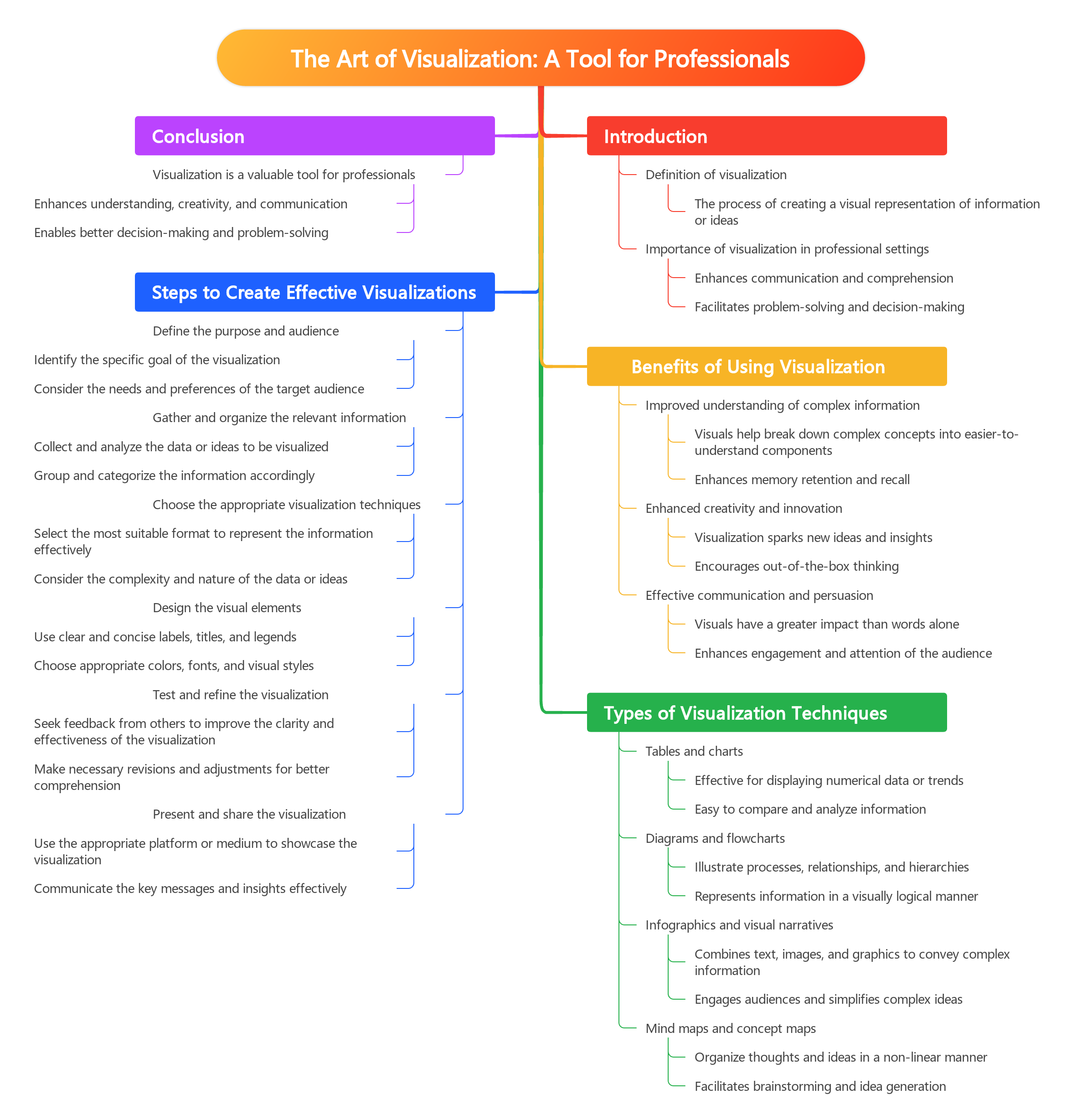
Benefits of Visualization for Professionals
Visualization is a powerful tool that can greatly benefit professionals in various industries. One of the main advantages of visualization for professionals is its ability to enhance creativity and problem-solving skills. By creating visual representations of ideas, concepts, and data, professionals can gain new insights and perspectives that may not be apparent through traditional methods. This can lead to innovative solutions and more effective decision-making processes.
Another benefit of visualization for professionals is its ability to improve communication and collaboration within teams. Visuals can help simplify complex information and make it easier for team members to understand and engage with. This can lead to more productive meetings, clearer presentations, and increased efficiency in project management. By using visuals to convey information, professionals can ensure that everyone is on the same page and working towards a common goal.
Visualization can also help professionals stay organized and focused on their goals. By creating visual representations of their objectives, priorities, and tasks, professionals can better track their progress and stay motivated. This can lead to increased productivity, better time management, and a greater sense of accomplishment. Visuals can also help professionals stay motivated and inspired by reminding them of their long-term goals and the impact of their work.
In addition, visualization can help professionals improve their memory and retention of information. By creating visual cues and associations, professionals can better encode and retrieve information from their long-term memory. This can be especially helpful in learning new skills, remembering key details, and recalling important information during presentations or meetings. Visuals can also help professionals make connections between different pieces of information and see patterns that may not be obvious through text alone.
Overall, visualization is a valuable tool for professionals in any industry. By harnessing the power of visuals, professionals can enhance their creativity, communication, organization, memory, and decision-making skills. Whether you are a marketer, designer, engineer, or any other type of professional, incorporating visualization into your workflow can help you unlock new possibilities and achieve greater success in your career.
2: Understanding Different Types of Visualization
Infographics
Infographics are powerful visual tools that can effectively communicate complex information in a simple and engaging way. They combine text, images, and data to create a visually appealing and informative representation of information. In today’s fast-paced world, where attention spans are short and information overload is common, infographics are a valuable tool for professionals to effectively convey their message to their audience.
One of the key benefits of using infographics is that they can help professionals break down complex information into easily digestible chunks. By presenting information in a visually appealing format, infographics can help professionals grab their audience’s attention and hold it long enough to convey their message effectively. This can be especially helpful when trying to communicate data-heavy information or complex concepts that may be difficult for the average person to understand.
In addition to being visually appealing, infographics are also highly shareable. In today’s digital age, where social media plays a significant role in how information is disseminated, infographics can be easily shared across various platforms, increasing their reach and potential impact. Professionals can use infographics to enhance their social media presence, attract more followers, and establish themselves as thought leaders in their respective fields.
Another benefit of using infographics is that they can help professionals stand out in a crowded marketplace. With so much information competing for people’s attention, it’s important for professionals to find ways to differentiate themselves from their competitors. By using infographics to present their information in a visually appealing and engaging way, professionals can capture their audience’s attention and leave a lasting impression.
Overall, infographics are a valuable tool for professionals looking to communicate their message effectively, break through the noise of information overload, and stand out in a crowded marketplace. By incorporating infographics into their communication strategy, professionals can enhance their brand, attract more followers, and establish themselves as leaders in their respective fields. Whether you’re a marketer, educator, or business owner, infographics can help you communicate your message in a compelling and impactful way.
Mind Maps
Mind maps are a powerful visualization tool that can revolutionize the way professionals think and approach problem-solving. This technique involves creating a visual representation of ideas, concepts, and connections in a non-linear format, allowing for deeper understanding and creativity. By using mind maps, professionals can organize thoughts, make connections between different pieces of information, and generate new ideas more effectively.
One of the key benefits of using mind maps is their ability to help professionals see the big picture and identify patterns and relationships that may not be immediately apparent. By visually mapping out thoughts and concepts, individuals can gain a clearer understanding of complex topics and make connections that they may have missed through traditional linear thinking. This can lead to more innovative solutions and a deeper level of comprehension.
Another advantage of mind maps is their versatility and adaptability. Professionals can use mind maps in a variety of ways, whether it’s for brainstorming new ideas, organizing information, planning projects, or problem-solving. The non-linear nature of mind maps allows for greater flexibility and creativity, making them a valuable tool for professionals in any field.
In addition to improving creativity and problem-solving skills, mind maps can also enhance memory and retention. Studies have shown that visual aids, such as mind maps, can help individuals retain information more effectively than traditional note-taking methods. By incorporating images, colors, and spatial relationships into their maps, professionals can create a visual representation that is easier to recall and understand.
Overall, incorporating mind maps into your professional toolkit can have a profound impact on the way you think and work. By harnessing the power of visualization, professionals can unlock new levels of creativity, organization, and problem-solving that can lead to greater success in their careers. So, whether you’re a business executive, educator, or creative professional, consider adding mind maps to your repertoire of visual tools to enhance your thinking and productivity.
Flowcharts
Flowcharts are a powerful visual tool that can help professionals better understand complex processes, systems, and decision-making paths. By breaking down a series of steps or actions into a visual diagram, flowcharts provide a clear and concise representation of how something works or should be executed. This makes them an invaluable resource for professionals in a wide range of industries, from project management to software development.
One of the key benefits of using flowcharts is their ability to simplify complex information and make it easier to digest. By presenting information in a visual format, professionals can quickly see the relationships between different steps or components of a process. This can help them identify bottlenecks, inefficiencies, or areas for improvement, leading to more effective decision-making and problem-solving.
Another advantage of flowcharts is their versatility. They can be used to document a wide range of processes and systems, from simple linear workflows to complex decision trees. This makes them a valuable tool for professionals in any industry, as they can be tailored to suit the specific needs of a project or task.
In addition to aiding in understanding and analysis, flowcharts can also serve as a communication tool. When working in a team or collaborating with others, a well-designed flowchart can help to ensure that everyone is on the same page and working towards a common goal. This can lead to improved efficiency, productivity, and overall success in achieving project objectives.
Overall, flowcharts are a valuable resource for professionals looking to enhance their visualization skills and improve their ability to understand and communicate complex information. By incorporating flowcharts into their toolkit, professionals can gain a new perspective on their work and develop more effective strategies for problem-solving and decision-making.
3: Using Visualization for Problem Solving
Identifying the Problem
In this subchapter, we will discuss the crucial step of identifying the problem when it comes to using visualization as a tool for professionals. This step is essential in order to effectively tackle the issue at hand and find the best solution possible. By clearly defining the problem, professionals can create a roadmap for success and ensure that their visuals are aligned with their goals.
One of the first steps in identifying the problem is to gather all relevant information and data related to the issue. This may involve conducting research, speaking with key stakeholders, and analyzing previous solutions that have been attempted. By taking a comprehensive approach to gathering information, professionals can gain a deeper understanding of the problem and its underlying causes.
Once all relevant information has been gathered, professionals must then define the problem in clear and specific terms. This involves breaking down the issue into its key components and identifying the root cause of the problem. By clearly defining the problem, professionals can avoid wasting time and resources on solutions that are not addressing the underlying issue.
After defining the problem, professionals should then prioritize the key aspects that need to be addressed. This may involve identifying the most urgent issues that need to be resolved first, as well as setting clear goals and objectives for the visualization process. By prioritizing key aspects of the problem, professionals can ensure that their visuals are focused on the most important issues.
In conclusion, identifying the problem is a crucial step in using visualization as a tool for professionals. By gathering relevant information, defining the problem in clear terms, and prioritizing key aspects, professionals can create visuals that are aligned with their goals and effectively address the underlying issues. This step is essential for success in any professional setting, and can help professionals to think more critically and creatively about the challenges they face.
Creating Visual Solutions
Visual solutions play a crucial role in the way professionals approach problem-solving and decision-making. In today’s fast-paced world, the ability to communicate complex ideas and concepts in a clear and concise manner is more important than ever. By harnessing the power of visuals, professionals can effectively convey their ideas, engage their audience, and inspire action.
One key aspect of creating visual solutions is understanding the needs and preferences of your audience. Different visuals resonate with different individuals, so it’s important to tailor your approach to suit the specific needs of your target audience. By taking the time to understand the preferences of your audience, you can create visuals that are not only visually appealing but also highly effective in conveying your message.
Another important aspect of creating visual solutions is choosing the right tools and techniques for the job. There are countless tools available to professionals today, ranging from traditional pen and paper to cutting-edge digital software. By experimenting with different tools and techniques, professionals can discover new ways to visualize their ideas and bring them to life in a compelling and engaging manner.
When creating visual solutions, it’s also important to consider the context in which your visuals will be presented. Whether you’re creating a presentation for a client, a report for your team, or a social media post for your followers, the context of your visuals can have a significant impact on their effectiveness. By tailoring your visuals to suit the specific context in which they will be used, you can ensure that they have the maximum impact and achieve the desired results.
In today’s competitive business environment, professionals who are able to create compelling visual solutions have a distinct advantage. By harnessing the power of visuals, professionals can not only communicate their ideas more effectively but also inspire action, drive engagement, and achieve their goals. By following these key principles and techniques, professionals can create visuals that will change the way they think and revolutionize the way they work.
4: Visualizing Data for Decision Making
Data Visualization Tools
Data visualization tools are essential for professionals in today’s data-driven world. These tools allow individuals to transform raw data into easy-to-understand visuals that can help them make informed decisions and communicate complex information with ease. In this subchapter, we will explore some of the top data visualization tools that are revolutionizing the way professionals think about and interact with data.
One of the most popular data visualization tools is Tableau, which allows users to create interactive dashboards and reports that can be easily shared with colleagues. Tableau’s intuitive drag-and-drop interface makes it easy for professionals to explore and analyze their data in real-time, helping them uncover valuable insights and trends.
Another powerful data visualization tool is Microsoft Power BI, which offers a wide range of visualization options and data connection capabilities. Professionals can use Power BI to create stunning reports and dashboards that can be accessed from anywhere, making it easy to collaborate and share information with others.
For professionals looking to create interactive and dynamic visualizations, D3.js is a popular choice. This open-source JavaScript library allows users to build custom data visualizations using HTML, SVG, and CSS, giving them full control over the look and feel of their visualizations.
In addition to these tools, professionals can also turn to tools like Google Data Studio, which offers a simple and intuitive way to create and share data visualizations online. With Google Data Studio, professionals can easily connect to their data sources and create dynamic reports and dashboards that can be customized to meet their specific needs.
Overall, data visualization tools are essential for professionals looking to make sense of the vast amounts of data at their disposal. By using these tools effectively, professionals can uncover valuable insights, communicate complex information with ease, and make informed decisions that drive success in their fields.
Interpreting Data through Visuals
Interpreting data through visuals is a crucial skill for any professional in today’s fast-paced world. In the book “The Art of Visualization: A Tool for Professionals,” we delve into the importance of using visuals to make sense of complex data and communicate insights effectively. By mastering this skill, professionals can transform raw data into powerful narratives that drive informed decision-making and innovative solutions.
Visuals are powerful tools for simplifying complex information and making it easier to understand. With the rise of big data, professionals are often overwhelmed with vast amounts of information that can be difficult to process. By creating visuals such as charts, graphs, and infographics, professionals can distill key insights and trends from data, allowing them to make informed decisions quickly and confidently.
One of the most effective ways to interpret data through visuals is by using data visualization techniques. Data visualization is the process of representing data in visual forms such as charts, graphs, and maps to help viewers understand the significance of the data. By leveraging the power of data visualization, professionals can uncover hidden patterns and trends in data that may not be immediately apparent when looking at raw numbers.
In “The Art of Visualization,” we explore 10 visuals that will change the way professionals think about data. From bar charts and pie graphs to heat maps and scatter plots, each visual has its own unique strengths and can be used to convey different types of information. By understanding how to choose the right visual for the data at hand, professionals can communicate their findings more effectively and engage their audience in a meaningful way.
Ultimately, mastering the art of interpreting data through visuals is a valuable skill for any professional looking to stay ahead in today’s data-driven world. By learning how to create compelling visuals that tell a story and communicate insights clearly, professionals can leverage the power of visualization to drive innovation, make informed decisions, and unlock new opportunities for growth and success.
5: Enhancing Communication with Visuals
Using Visuals in Presentations
Visuals are an essential tool for professionals looking to enhance their presentations and effectively communicate complex ideas. When used strategically, visuals can help convey information in a way that is easy to understand and memorable for your audience. In this subchapter, we will explore the various types of visuals that can be used in presentations and how to effectively incorporate them into your professional communication.
One of the most common visuals used in presentations is the classic pie chart. Pie charts are great for showing proportions and percentages in a visually appealing way. They can help your audience quickly grasp the relative sizes of different categories and understand the distribution of data at a glance.
Another powerful visual tool is the bar graph. Bar graphs are perfect for comparing different categories or trends over time. By using different colors or patterns, you can make your data more visually engaging and easier to interpret. Bar graphs can help highlight important trends and outliers in your data, making your presentation more impactful and informative.
In addition to pie charts and bar graphs, line graphs are another valuable visual tool for professionals. Line graphs are ideal for showing trends and changes over time. By plotting data points on a graph and connecting them with a line, you can illustrate the progression of a variable and make predictions about future trends. Line graphs can help your audience understand the relationships between different variables and make informed decisions based on the data presented.
Tables and matrices are also important visuals that can be used in presentations to organize and display large amounts of data. Tables are great for presenting detailed information in a structured format, while matrices can help visualize complex relationships between variables. By using tables and matrices in your presentations, you can help your audience make sense of complicated data sets and draw meaningful insights from the information presented.
In conclusion, visuals are a powerful tool for professionals looking to enhance their presentations and communicate complex ideas effectively. By using visuals such as pie charts, bar graphs, line graphs, tables, and matrices, you can make your data more engaging and easier to understand for your audience. Incorporating visuals into your presentations can help you convey information in a visually appealing way and make a lasting impression on your audience. Mastering the art of using visuals in presentations can truly change the way you think and communicate as a professional.
Visuals for Collaborative Work
Visuals play a crucial role in facilitating collaborative work among professionals across various industries. They serve as powerful tools for communication, problem-solving, and decision-making. In this subchapter, we will explore the top 10 visuals that can transform the way you think and work with others.
1. Mind Maps: Mind maps are great for brainstorming ideas, organizing thoughts, and making connections between different concepts. They provide a visual representation of complex information, making it easier to understand and share with others.
2. Flowcharts: Flowcharts are essential for mapping out processes, identifying bottlenecks, and improving workflow efficiency. They help teams visualize the sequence of tasks and decision points, enabling them to streamline operations and achieve better results.
3. Gantt Charts: Gantt charts are indispensable for project management, as they provide a timeline view of tasks, deadlines, and dependencies. They help teams stay on track, allocate resources effectively, and meet project milestones in a timely manner.
4. SWOT Analysis: SWOT analysis visually represents an organization’s strengths, weaknesses, opportunities, and threats. It helps teams assess their competitive position, identify strategic priorities, and make informed decisions about future actions.
5. Venn Diagrams: Venn diagrams are useful for comparing and contrasting different sets of data or ideas. They help teams identify commonalities, differences, and overlaps, leading to deeper insights and more effective collaboration.
6. Bar Charts: Bar charts are ideal for comparing quantities, trends, and performance metrics. They provide a clear visual representation of data, allowing teams to track progress, identify patterns, and make data-driven decisions.
7. Pie Charts: Pie charts are great for illustrating proportions, percentages, and distributions. They help teams visualize the relative size of different components within a whole, enabling them to prioritize tasks, allocate resources, and make informed choices.
8. Scatter Plots: Scatter plots are effective for visualizing relationships between variables and identifying patterns in data. They help teams spot correlations, outliers, and trends, leading to more accurate predictions and better decision-making.
9. Network Diagrams: Network diagrams are essential for mapping out relationships, connections, and interactions between different entities. They help teams understand complex systems, identify key stakeholders, and optimize communication and collaboration.
10. Concept Maps: Concept maps are powerful tools for organizing and connecting ideas, theories, and knowledge domains. They help teams see the big picture, grasp complex concepts, and generate new insights through visualizing relationships and hierarchies.
In conclusion, incorporating visuals into collaborative work can enhance creativity, communication, and productivity among professionals. By leveraging the top 10 visuals discussed in this subchapter, you can transform the way you think, work with others, and achieve your professional goals. Start integrating these visuals into your daily workflow and experience the powerful impact they can have on your collaborative efforts.
6: Implementing Visualization in Daily Work
Integrating Visualization in Workflows
In today’s fast-paced world, professionals are constantly seeking new ways to enhance their workflow and improve their efficiency. One powerful tool that has been gaining popularity in recent years is visualization. By incorporating visual elements into their work processes, professionals can streamline tasks, communicate complex ideas more effectively, and make better-informed decisions. In this subchapter, we will explore the benefits of integrating visualization into workflows and discuss ten visuals that can revolutionize the way you think about your work.
Visualizations can help professionals organize and prioritize their tasks more effectively. By creating visual representations of their workflows, professionals can easily see which tasks are most important and where they should focus their attention. This can help them stay on track, meet deadlines, and achieve their goals more efficiently.
Furthermore, visualizations can help professionals communicate ideas more clearly and concisely. Instead of relying on lengthy written reports or confusing spreadsheets, professionals can use visuals such as charts, graphs, and diagrams to convey complex information in a more digestible format. This can help them communicate more effectively with colleagues, clients, and stakeholders, leading to better collaboration and more successful outcomes.
Visualizations can also help professionals make better-informed decisions. By visually representing data and information, professionals can identify patterns, trends, and insights that may not be immediately apparent in text-based formats. This can help them uncover hidden opportunities, avoid potential risks, and make more strategic decisions that are based on evidence rather than intuition.
In this subchapter, we will introduce ten powerful visuals that professionals can use to enhance their workflows and improve their decision-making processes. From mind maps and flowcharts to timelines and infographics, each visualization offers a unique way to organize, analyze, and communicate information. By incorporating these visuals into their work processes, professionals can unlock new insights, boost their productivity, and achieve greater success in their careers.
In conclusion, integrating visualization into workflows can be a game-changer for professionals in any industry. By leveraging the power of visuals, professionals can streamline tasks, communicate more effectively, and make better-informed decisions. The ten visuals we will explore in this subchapter are just the beginning – by experimenting with different visualization techniques and finding what works best for their unique needs, professionals can transform the way they think about their work and achieve new levels of success.
Overcoming Common Visualization Challenges
Visualization is a powerful tool that can help professionals communicate complex ideas and concepts in a clear and concise manner. However, many individuals may face common challenges when it comes to creating effective visuals. In this subchapter, we will explore some of the most common visualization challenges and provide strategies for overcoming them.
One common challenge that professionals may face when creating visuals is selecting the appropriate type of visualization for their data. With so many options available, it can be overwhelming to determine which type of visual will best represent the information at hand. To overcome this challenge, professionals should consider the message they want to convey and the audience they are trying to reach. By understanding these factors, individuals can choose the most appropriate visual that will effectively communicate their message.
Another common challenge in visualization is cluttered and confusing visuals. When professionals try to cram too much information into a single visual, it can become overwhelming for the audience to interpret. To avoid this issue, individuals should strive to keep their visuals simple and focused. By using clear labels, colors, and design elements, professionals can create visuals that are easy to understand and visually appealing.
In addition to cluttered visuals, professionals may also struggle with ineffective storytelling in their visuals. Without a clear narrative or structure, visuals can fail to engage the audience and convey the intended message. To address this challenge, professionals should consider the key points they want to highlight in their visual and create a clear storyline that guides the viewer through the information. By incorporating elements such as titles, annotations, and captions, professionals can create visuals that tell a compelling story and resonate with the audience.
Lastly, professionals may encounter challenges with data accuracy and representation in their visuals. Inaccurate or misleading data can undermine the credibility of a visual and lead to misinterpretation by the audience. To ensure data accuracy, professionals should carefully review and verify their data sources before creating visuals. Additionally, individuals should strive to accurately represent the data in their visuals by using appropriate scales, labels, and legends. By taking these steps, professionals can create visuals that are not only visually appealing but also accurate and trustworthy.
7: Case Studies of Successful Visualization Strategies
Visualization in Marketing Campaigns
Visualization is a powerful tool in marketing campaigns that can greatly impact the way professionals approach their strategies. By incorporating compelling visuals into their campaigns, professionals can captivate their audience and leave a lasting impression. Visuals are known to be more engaging and memorable than text alone, making them an essential component of any successful marketing campaign.
One key aspect of visualization in marketing campaigns is the use of infographics. Infographics combine text and visuals to present information in a visually appealing and easy-to-understand format. By using infographics, professionals can convey complex information in a way that is both informative and visually stimulating. This can help to capture the attention of their audience and make their message more memorable.
Another important aspect of visualization in marketing campaigns is the use of videos. Videos are a highly engaging form of visual content that can effectively communicate a message in a dynamic and interactive way. By incorporating videos into their campaigns, professionals can create a more immersive experience for their audience and convey their message in a more compelling manner.
Furthermore, the use of interactive visuals such as quizzes, polls, and interactive maps can also enhance the effectiveness of marketing campaigns. These interactive visuals can engage the audience and encourage them to actively participate in the content, making the experience more personalized and memorable. By incorporating interactive visuals into their campaigns, professionals can create a more engaging and interactive experience for their audience.
In conclusion, visualization plays a crucial role in marketing campaigns by helping professionals to create engaging and memorable content that resonates with their audience. By incorporating compelling visuals such as infographics, videos, and interactive content into their campaigns, professionals can effectively communicate their message and leave a lasting impression on their audience. Visualization is a powerful tool that can greatly enhance the effectiveness of marketing campaigns and help professionals to achieve their goals.
Visualization in Project Management
Visualization in project management is a crucial tool for professionals in any industry. By creating visual representations of data, timelines, and goals, project managers can effectively communicate complex information to team members and stakeholders. Visuals help to simplify complicated concepts, making it easier for everyone involved to understand the project’s objectives and progress.
One of the most common visual tools used in project management is the Gantt chart. This chart provides a visual representation of a project schedule, showing tasks, timelines, and dependencies. By using a Gantt chart, project managers can easily track progress, identify potential bottlenecks, and make adjustments to the schedule as needed. This visual tool is invaluable for keeping projects on track and ensuring that deadlines are met.
Another important visual in project management is the Kanban board. This tool is used to visualize workflow, showing tasks as cards that move through different stages of completion. By using a Kanban board, project managers can quickly see which tasks are in progress, which are completed, and which are still pending. This visual representation helps to streamline workflow and improve efficiency within the project team.
Mind maps are also a valuable visualization tool for project managers. These diagrams help to organize and visualize complex information, making it easier to see connections between different ideas and tasks. By using mind maps, project managers can brainstorm ideas, identify key objectives, and create a roadmap for the project. This visual tool is particularly useful for planning and organizing tasks in a logical and structured way.
In addition to these visual tools, professionals in project management can benefit from using other visuals such as flowcharts, diagrams, and dashboards. Each of these visual tools serves a specific purpose in helping project managers communicate information, track progress, and make informed decisions. By incorporating visuals into their project management practices, professionals can improve communication, increase efficiency, and ultimately achieve greater success in their projects.
8: Tips for Improving Visualization Skills
Practicing Visualization Techniques
Practicing visualization techniques is a powerful tool that can help professionals in any field unlock their creative potential and achieve their goals. By visualizing their desired outcomes and taking the time to imagine the steps needed to reach them, professionals can enhance their problem-solving skills and develop a clearer path to success.
One of the most effective visualization techniques for professionals is creating a vision board. A vision board is a collage of images, words, and phrases that represent your goals and aspirations. By regularly looking at your vision board and visualizing yourself achieving your goals, you can stay motivated and focused on your objectives.
Another visualization technique that professionals can practice is guided imagery. Guided imagery involves using all of your senses to imagine a specific scenario or outcome. By vividly picturing yourself in a successful situation, you can boost your confidence and improve your performance in real-life situations.
Mental rehearsal is another valuable visualization technique for professionals. By mentally rehearsing a challenging situation or presentation before it happens, professionals can reduce anxiety and improve their performance. This technique can help professionals feel more prepared and confident in high-pressure situations.
In conclusion, practicing visualization techniques can have a profound impact on the way professionals think and approach their work. By incorporating visualization exercises into their daily routines, professionals can enhance their problem-solving skills, boost their confidence, and achieve their goals with greater ease. Whether it’s creating a vision board, practicing guided imagery, or engaging in mental rehearsal, professionals can harness the power of visualization to unlock their full potential and excel in their careers.
Seeking Feedback for Improvement
Feedback is an essential part of growth and improvement in any profession. Seeking feedback allows professionals to gain valuable insights into their work, helping them identify areas of strengths and weaknesses. In the world of visualization, feedback can play a crucial role in enhancing the impact and effectiveness of visuals created. In this subchapter, we will explore the importance of seeking feedback for improvement in the context of visualization.
One of the key benefits of seeking feedback for professionals in the field of visualization is the opportunity to receive fresh perspectives on their work. By sharing their visuals with others and soliciting feedback, professionals can gain new insights and ideas that they may not have considered on their own. This can lead to more innovative and impactful visualizations that resonate with their audience.
Furthermore, seeking feedback can help professionals identify areas for improvement in their visualizations. Constructive criticism from peers or mentors can highlight areas where visuals may be unclear, unengaging, or ineffective. By taking this feedback on board, professionals can make necessary adjustments to enhance the overall quality of their visuals and ensure they effectively convey their intended message.
In addition to improving the quality of visuals, seeking feedback can also help professionals grow and develop their skills in visualization. By actively seeking feedback and incorporating it into their work, professionals can learn from their mistakes and continue to refine their craft. This ongoing process of feedback and improvement is essential for professionals looking to stay relevant and competitive in the ever-evolving field of visualization.
Overall, seeking feedback for improvement is a crucial practice for any professional looking to excel in the field of visualization. By actively soliciting feedback, professionals can gain valuable insights, identify areas for improvement, and continue to grow and develop their skills. In the world of visualization, feedback is not just a means for improvement, but a powerful tool for innovation and success.
9: The Future of Visualization in Professional Settings
Emerging Trends in Visualization
In today’s fast-paced world, the importance of effective visualization cannot be overstated. As professionals in a variety of fields, it is crucial to stay up-to-date on emerging trends in visualization in order to effectively communicate complex ideas and data to colleagues and clients. In this subchapter, we will explore 10 visuals that are changing the way professionals think about visualization.
One emerging trend in visualization is the use of interactive dashboards. These dynamic tools allow professionals to manipulate data in real-time, uncovering insights and trends that may have otherwise gone unnoticed. With the ability to drill down into specific data points and customize views, interactive dashboards are revolutionizing the way professionals analyze and present information.
Another trend that is gaining popularity is the use of virtual reality (VR) and augmented reality (AR) in visualization. These immersive technologies allow professionals to create interactive 3D visualizations that provide a more engaging and realistic experience for users. From virtual walk-throughs of architectural designs to interactive data visualizations, VR and AR are transforming the way professionals present and interact with information.
In addition to interactive dashboards and VR/AR technologies, another emerging trend in visualization is the use of storytelling techniques. By weaving data and insights into a compelling narrative, professionals can create visualizations that are not only informative but also engaging and memorable. Whether presenting to a board of directors or pitching a new idea to clients, storytelling through visualization can help professionals communicate their message more effectively.
Furthermore, the rise of artificial intelligence (AI) and machine learning is also impacting the field of visualization. These technologies are enabling professionals to analyze vast amounts of data and generate visualizations that highlight patterns and trends that may have been impossible to uncover manually. By leveraging AI and machine learning algorithms, professionals can create visualizations that provide deeper insights and drive more informed decision-making.
As professionals continue to navigate the ever-evolving landscape of visualization, it is essential to stay informed about emerging trends and technologies. By incorporating interactive dashboards, VR/AR technologies, storytelling techniques, and AI/machine learning into their visualization practices, professionals can enhance their ability to communicate complex ideas and data effectively. By embracing these trends, professionals can stay ahead of the curve and elevate their visualization skills to new heights.
Harnessing the Power of AI for Advanced Visualization
In today’s fast-paced world, professionals are constantly seeking innovative tools and techniques to enhance their work and stay ahead of the curve. One such tool that has been gaining traction in recent years is artificial intelligence (AI). Harnessing the power of AI for advanced visualization can revolutionize the way professionals think and approach their work. In this subchapter, we will explore how AI can be used to create stunning visuals that not only captivate audiences but also convey complex information in an easily digestible format.
AI has the ability to analyze massive amounts of data and extract valuable insights that may not be immediately apparent to the human eye. By incorporating AI algorithms into the visualization process, professionals can uncover hidden patterns, trends, and correlations that can inform decision-making and drive innovation. This level of advanced analysis would be nearly impossible to achieve manually, making AI an invaluable tool for professionals looking to gain a competitive edge in their field.
One of the key benefits of using AI for advanced visualization is the ability to automate the process of creating visuals. With AI-powered tools, professionals can quickly generate high-quality visuals without the need for manual intervention. This not only saves time and resources but also ensures greater consistency and accuracy in the final output. Whether it’s creating interactive dashboards, dynamic charts, or 3D models, AI can streamline the visualization process and empower professionals to focus on interpreting the data rather than formatting it.
Another advantage of harnessing the power of AI for visualization is the ability to personalize and customize visuals to suit specific needs and preferences. AI algorithms can learn from user interactions and feedback to tailor visuals to individual preferences, making the information more relevant and engaging. This level of personalization can enhance the overall user experience and ensure that the visuals resonate with audiences on a deeper level. By leveraging AI for advanced visualization, professionals can create visuals that not only inform but also inspire, leaving a lasting impact on viewers.
In conclusion, the potential of AI for advanced visualization is limitless, offering professionals a powerful tool to transform complex data into compelling visuals that drive understanding and action. By incorporating AI algorithms into the visualization process, professionals can unlock new insights, automate tedious tasks, personalize visuals, and ultimately enhance their work in ways previously thought impossible. As we continue to explore the possibilities of AI in visualization, we can expect to see a new era of innovation and creativity unfold, shaping the way professionals think and interact with data.
10: Conclusion and Key Takeaways
Recap of Essential Visualization Strategies
In this subchapter, we will recap some of the essential visualization strategies that have been discussed throughout this book. Visualization is a powerful tool that can help professionals in any field enhance their understanding and communication of complex concepts. By incorporating these strategies into your practice, you can unlock new ways of thinking and problem-solving.
One of the key visualization strategies we have discussed is the use of mind maps. Mind maps are a visual representation of information that allows for connections to be made between different ideas. By creating a mind map, professionals can organize their thoughts and see the bigger picture of a project or problem. This can help in brainstorming new ideas and finding creative solutions.
Another important visualization strategy is the use of graphs and charts. Graphs and charts can help professionals easily convey data and statistics in a visually appealing way. Whether it’s a bar graph, pie chart, or line graph, choosing the right type of visualization can make complex information more digestible for your audience.
Visual metaphors are another powerful visualization strategy that can help professionals communicate abstract concepts in a more concrete way. By using visual metaphors, professionals can make their ideas more relatable and memorable to their audience. This can help in gaining buy-in from stakeholders and making a lasting impact with your message.
One visualization strategy that is often overlooked is the use of color and design. By incorporating color theory and design principles into your visuals, you can make them more engaging and effective. Whether it’s using a color scheme that reflects your brand identity or choosing fonts that are easy to read, paying attention to these details can elevate your visual communication.
Overall, incorporating these essential visualization strategies into your practice can help you become a more effective and impactful professional. By using mind maps, graphs and charts, visual metaphors, and color and design, you can enhance your understanding and communication of complex concepts. So, take the time to explore these strategies and experiment with different visual techniques to see how they can change the way you think and work.
Final Thoughts on Harnessing the Art of Visualization for Success
As we come to the end of this subchapter on harnessing the art of visualization for success, it is important to reflect on the key takeaways that can truly make a difference in the lives of any professionals. Visualization is not just a tool for manifesting desires, but a powerful technique that can help reshape our thoughts, beliefs, and actions to achieve our goals and dreams.
One of the key aspects of visualization that we have discussed is the importance of clarity and specificity in our visualizations. By creating detailed mental images of our desired outcomes, we can program our subconscious mind to work towards making them a reality. This process of mental rehearsal can help us stay focused and motivated in the pursuit of our goals, no matter how big or small they may be.
Another important point to consider is the role of emotions in visualization. It is not enough to simply visualize our goals; we must also feel the emotions associated with achieving them. By tapping into the feelings of joy, gratitude, and success, we can create a powerful energetic vibration that attracts positive outcomes into our lives.
Furthermore, the use of affirmations and positive self-talk can enhance the effectiveness of visualization. By repeating empowering statements and beliefs, we can reprogram our subconscious mind to align with our goals and aspirations. This practice can help us overcome limiting beliefs and self-doubt, allowing us to step into our full potential as professionals.
In conclusion, the art of visualization is a transformative tool that can unlock the full potential of any professional. By harnessing the power of mental imagery, emotions, affirmations, and positive self-talk, we can create a clear path towards success and fulfillment in our personal and professional lives. I encourage you to explore these techniques further and incorporate them into your daily routine to see tangible results in your career and overall well-being. Remember, the power of visualization lies within you – use it wisely and watch your dreams come to life.